
When Ilford announced that Pan F Plus 50 would finally be available in 4×5 sheet film, it immediately caught my attention. Pan F has long occupied a special place in black-and-white photography and its always been a favourite emulsion of mine. For decades it has been available in roll film and 35mm formats, earning a reputation for exceptionally fine grain, high acutance, and a tonal scale that favours photographers looking for crisp, luminous negatives. Yet many large-format photographers had hoped for years to see it offered as a sheet film.
Ilford solved all the challenges in getting this emulsion stable on a sheet film base and with the recent release of Pan F Plus in 4×5, that wish of many photographers I know was finally granted.
I purchased a box as soon as it became available and loaded it up 12 sheets in 6 film holders and grabbed my Linhof Super Technika IV, one of my favourite field cameras.
The exposed sheets were developed in Ilford Perceptol diluted 1+1 for 15 minutes at 20°C, scanned on an Epson Expression 10000XL, and given only modest adjustments in Lightroom.
These photographs were made at three locations in southern Ontario: the Cheltenham Badlands, Meadowvale Conservation Area, and Limehouse Conservation Area.
After working with the film, my impression is simple: Pan F Plus in 4×5 is everything I hoped it would be.
- Outstanding Sharpness
- High Contrast
- Smooth Tonality
A Film Designed for Resolution
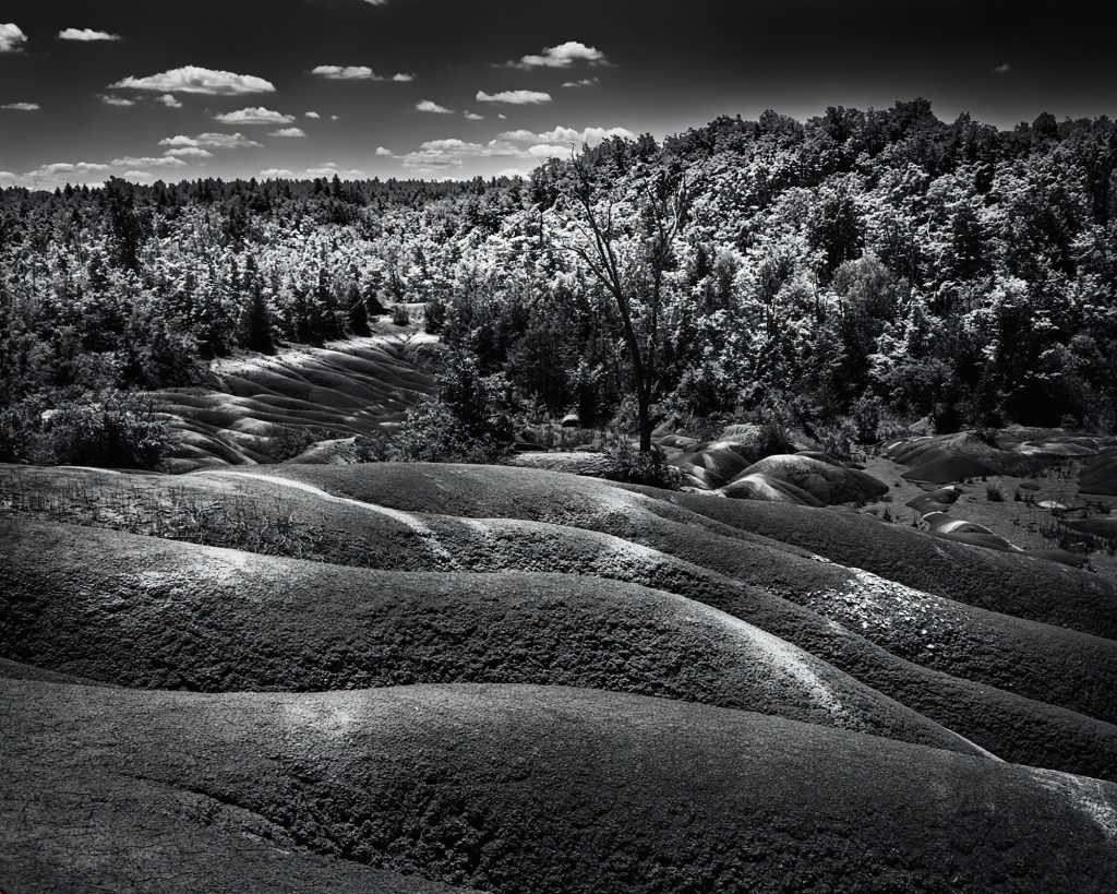
Pan F Plus is an ISO 50 panchromatic emulsion that has always been marketed as one of the sharpest films Ilford produces. While grain is rarely a limiting factor in large format photography, the characteristics of the emulsion still matter. What Pan F brings to 4×5 is an almost startling level of microcontrast and edge definition.
Even on a flatbed scan from the Epson 10000XL—which is not capable of extracting every ounce of detail contained in a 4×5 negative—the film exhibits an impressive sense of clarity. Fine textures separate cleanly from one another, and edges appear almost etched.
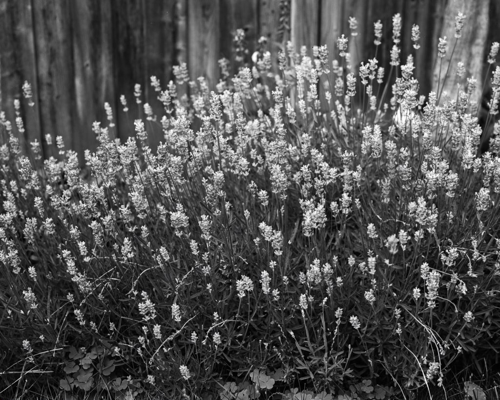
The image of the lavender plants against the weathered fence demonstrates this particularly well. Individual blossoms retain delicate tonal separation while the vertical boards in the background remain distinct and well defined. There is an almost three-dimensional quality to the image that comes from Pan F’s combination of fine grain and strong local contrast.
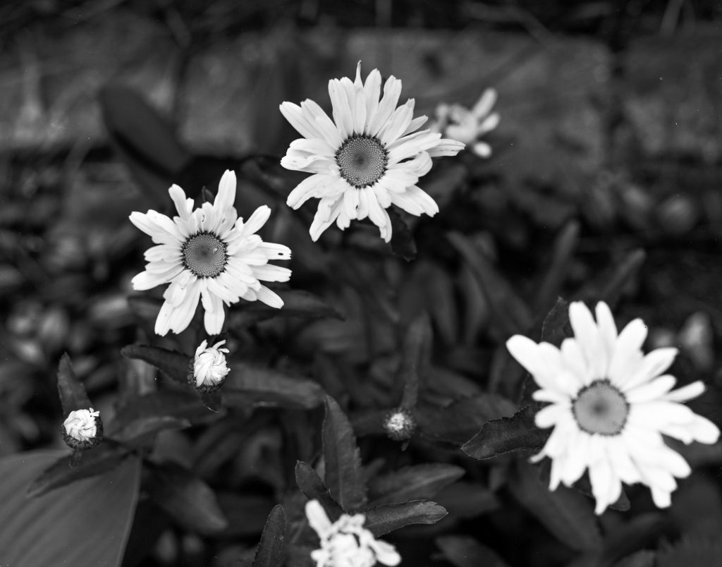
The same characteristic is evident in the daisies above. Looking closely at the centre of the flowers, the intricate texture of the seed heads is rendered with remarkable precision, while the out-of-focus blooms maintain a smooth transition into blur. Pan F does not have the gentleness associated with films such as FP4 Plus. Instead, it possesses a crisp, energetic rendering that rewards careful exposure.
Contrast: A Signature Characteristic
Pan F Plus has always been known as a contrasty film, and these negatives confirmed that reputation.
Photographers accustomed to FP4 Plus or Delta 100 may initially find Pan F somewhat less forgiving. Midtones can compress quickly under harsh sunlight, and highlights require attention during exposure. Fortunately, the high contrast is also part of the film’s appeal.
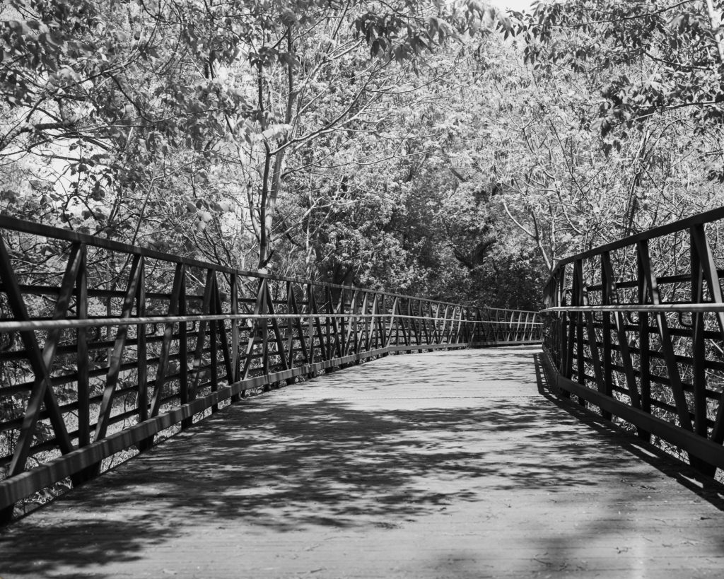
The bridge photograph from Meadowvale Conservation Area illustrates this beautifully. The deep shadows beneath the railing, the bright sunlit decking, and the dappled foliage overhead create a scene with considerable brightness range. Pan F translates these elements into a dramatic composition with blacks that anchor the frame and highlights that remain bright without appearing chalky.
The film seems particularly well suited to scenes containing strong geometric elements, textured surfaces, and subjects illuminated by directional light.
Metering carefully and exposing for the shadows remains important. Pan F rewards precision, but it also asks for it.
Perceptol 1+1: Taming the Edge
Choosing Perceptol 1+1 was a deliberate decision.
Perceptol is often associated with fine grain and slightly reduced effective film speed, but it also has a moderating influence on films that can otherwise appear excessively harsh. In many ways it proved to be an ideal partner for Pan F.
Developed for fifteen minutes at 20°C, the negatives retained excellent sharpness while avoiding blocked highlights. Perceptol softened the film’s inherent aggressiveness just enough to maintain open tonal values in bright areas.
The resulting negatives have a refined quality that balances Pan F’s natural bite.
Had I used a more energetic developer such as ID-11 stock solution or HC-110, I suspect the negatives would have exhibited even greater contrast. Perceptol helped preserve subtle detail in petals, leaves, and cloudless bright skies while still maintaining the distinctive Pan F look.
Some photographers avoid Perceptol because of the slight speed loss it can introduce, but with a sheet film camera mounted on a tripod and exposures made deliberately, sacrificing a fraction of a stop is largely inconsequential.
The Value of a Circular Polarizer
Another important contributor to these photographs was the use of a circular polarizing filter.
Although polarizers are often associated with colour photography, they can be equally valuable in black-and-white work.
The filter deepened foliage tones, reduced specular reflections from leaves, and increased separation between plant textures. In the lavender image, the polarizer helped suppress unwanted glare from the foliage, allowing the blossoms to stand out with greater tonal distinction.
On the bridge photograph, it enhanced the contrast between sunlit areas and shadow patterns cast across the deck. The effect is subtle but significant. Rather than relying on digital contrast adjustments after scanning, the filter improved tonal relationships at the moment of exposure.
A polarizer is one of the most useful accessories for large-format black-and-white photography because it enables the photographer to shape contrast optically rather than electronically.
Three Southern Ontario Landscapes
These images were made in three locations that are well worth visiting for photographers.
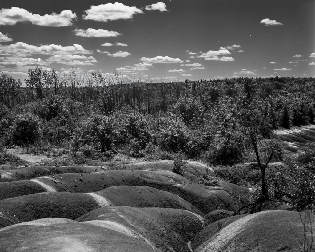
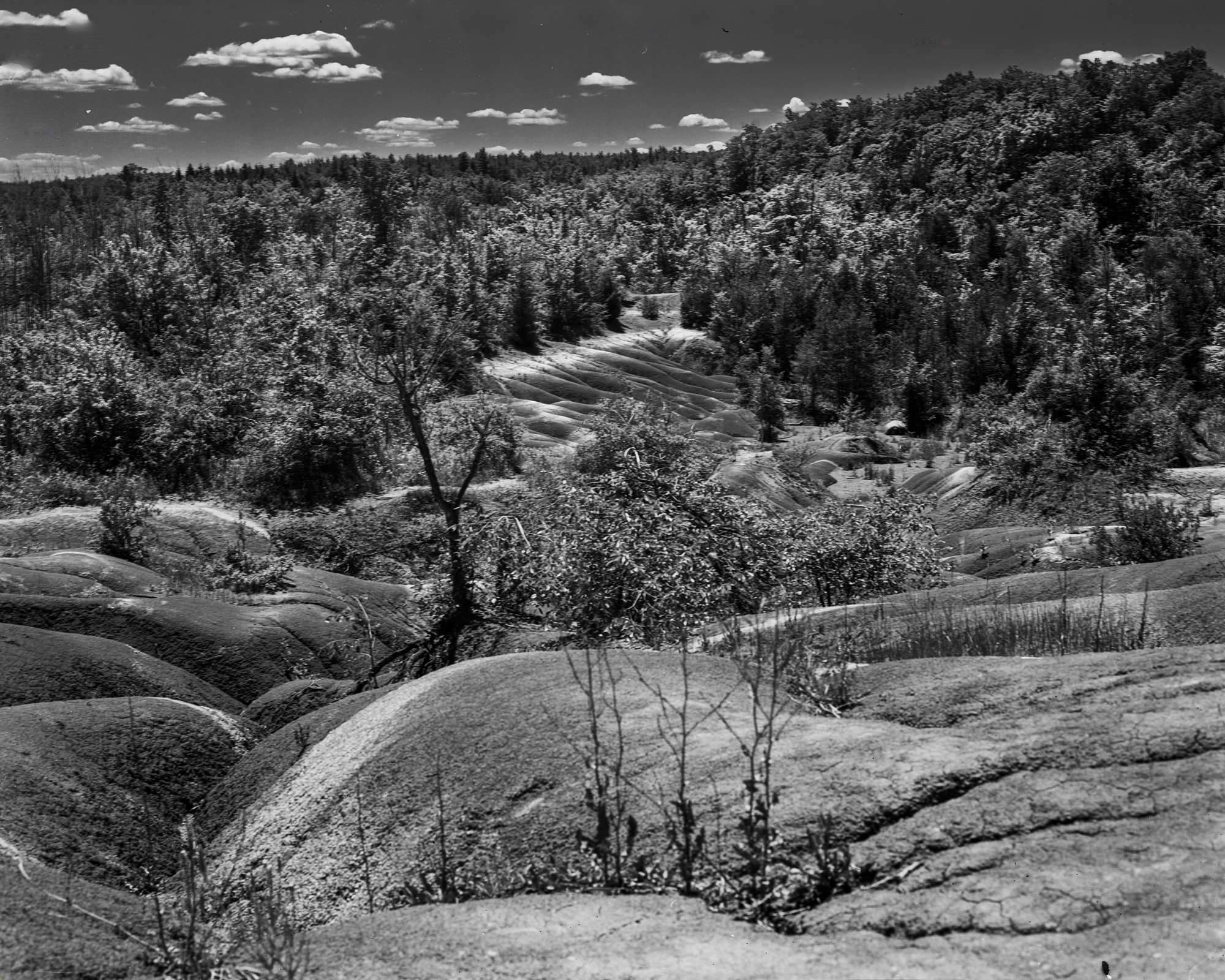
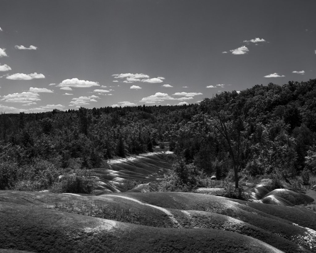
The Cheltenham Badlands are one of Ontario’s most unusual geological sites. The exposed Queenston shale creates rolling ridges and gullies striped in shades of red and grey. It is a location that lends itself naturally to monochrome photography because of its intricate textures and strong graphic patterns.
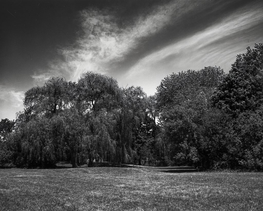
The Meadowvale Conservation Area, located along the Credit River, offers a quieter landscape of forests, trails, bridges, and streams. Light filtering through the canopy creates ever-changing shadow patterns, making it an excellent place to explore the tonal capabilities of black-and-white film.
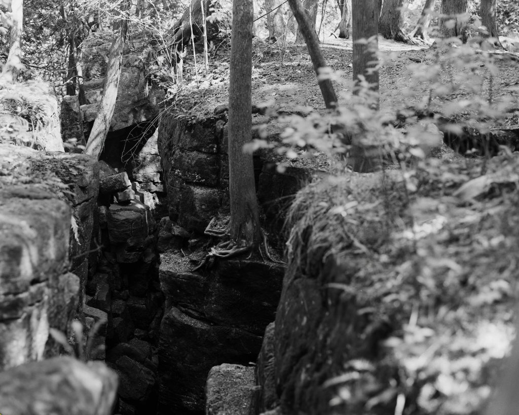
The Limehouse Conservation Area is perhaps best known for its limestone kilns, escarpment scenery, and sections of the Bruce Trail. Dense woodland and abundant wildflowers provide numerous opportunities for close studies and intimate landscape compositions.
All three locations complement Pan F’s strengths remarkably well.
Final Thoughts
After spending time with Pan F Plus in 4×5, I am convinced that Ilford made the right decision in adding it to the sheet film lineup.
This is not a film for every subject or every lighting condition. Its contrast can be demanding, and it benefits from careful exposure and thoughtful development choices. But for photographers seeking negatives with exceptional sharpness, pronounced microcontrast, and an almost medium-format-like crispness expanded to 4×5 proportions, Pan F Plus is deeply satisfying.
The combination of a Linhof Super Technika IV, Pan F Plus 50, Perceptol 1+1, and a circular polarizer produced negatives that feel unmistakably traditional—crafted slowly, with intention, and with very little need for digital intervention afterward.
Perhaps that is what impressed me most.
In an era where high-resolution digital cameras dominate discussions about image quality, a sheet of Pan F Plus measuring four by five inches quietly reminds us that resolution alone does not create a photograph. Tonality, texture, and the deliberate process of large-format photography still possess a unique visual language. Pan F Plus speaks that language fluently, and I look forward to exposing many more sheets.